Portfolio Feature
Parcel Goods + Gifts
The goal was to clarify what the shop was becoming and create a brand that could carry it forward.
Parcel is a curated gift shop in Edmond, Oklahoma, offering a thoughtful mix of gifts, home goods, paper products, and pieces that feel personal. Formerly Resonant Gifts, the shop was entering a new chapter with a new location, a more focused retail experience, and a clearer vision for what the business could become.
They needed a brand that could grow with that shift — one that better reflected the kind of shop they were building and made the business feel more established, intentional, and easy to understand.
brand rename
brand strategy
The Project Scope
brand identity
brand photography
The Logo
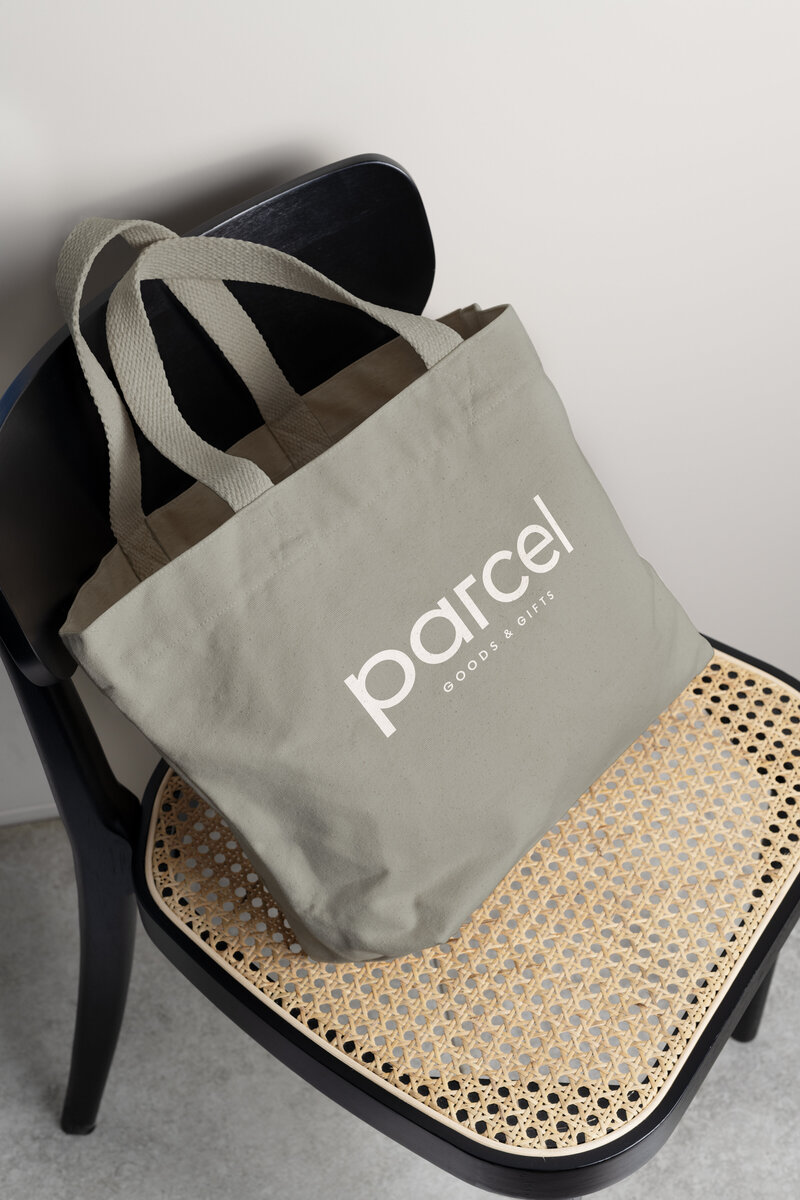
With the strategy in place, I started by exploring marks and typography that could hint at giving, gathering, and connection without feeling too obvious. The final logo brings together softer, rounded letterforms with more structured details, striking a balance that feels warm, clean, and pulled together.
Subtle custom details throughout the wordmark nod to the corners of a parcel or gift box, tying the name back to the idea of gifting in a way that feels natural, not forced. Paired with a flexible secondary line and supporting mark, the logo system is simple to use and works across everything from packaging and signage to social and everyday brand touchpoints.




Visual Identity
Parcel needed to feel polished, but not precious. The color palette brings in warmer, grounded tones that feel fitting for a gift shop — soft enough to feel welcoming, but still rich enough to hold its own across signage, packaging, and printed pieces.
The rest of the identity leans into the details people love about gifting: the wrapping, the layers, the little finishing touches. Simple patterns, clean typography, and flexible brand elements give Parcel a system that feels collected and charming without becoming too busy.


Logan McAlister, Parcel
We were both shocked that she came up with a name that we both loved on the first round. Even with the logo we didn’t even need a second round of revisions. The secondary logo is the only one that had little accent features we didn’t love and she worked to adjust quickly after our feedback.
We’re two years in and we haven’t had any time where we haven’t loved it as much as we first did. We are absolutely in love with what she came up with. It's been great and we’ve had great feedback from customers and friends.
what they're saying:
Brand Photography


For the brand photoshoot, we wanted to capture the shop in a way that felt warm and personal. We focused on the details that make gifting feel special — shelves filled with curated pieces, hands wrapping packages, paper goods, home items, and little moments throughout the shop. The goal was to create a gallery with variety, that they could use across social media, marketing, and brand materials without feeling overly staged.